Custom Charts
Charts are built from three building blocks: a measure, a dimension (optional), and a filter (optional).Measure
A measure is the value you want to aggregate. Each datapoint on the chart represents a bucket of calls. If you group by daily, each datapoint is a single day in which you may have received many calls. The measure defines how those calls are reduced to a single number. For example:SUM(.refund_amount)— total refund amount for that time periodAVG(.satisfaction_score)— average satisfaction score for that time periodCOUNT(.call_status)— number of calls that had a call_status valueCOUNT_DISTINCT(.call_status)— number of unique call_status values (e.g. “completed”, “voicemail”, etc.)COUNT(*)— total number of calls, regardless of any specific field. Useful when you just want to count calls that match a filter.
Dimension
A dimension splits your measure into separate series. Instead of one line on your chart, you get one line per distinct value of the dimension. For example, adding.call_status as a dimension turns a single “total refund amount” line into separate lines for completed, voicemail, no_answer, etc. There is a special dimension Agent which splits your data into a series per call agent
Dimensions are optional. Without one, your chart shows a single series.
If a call does not have a value for the dimension field, it is grouped under a special __NONE__ series so it still contributes to the chart rather than being silently dropped.
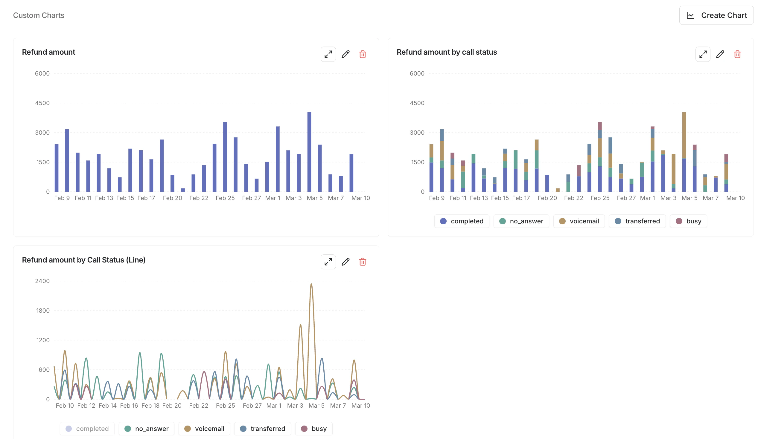
Here is an example of the same data no dimension, a dimension with display “Stacked Bar”, and a dimension with display “Line”
Filter
A filter restricts which calls are included before any aggregation happens. For example, “only include calls where.customer_sentiment is positive.”
Filters narrow the data — they do not create additional series. You can combine multiple filters and they are ANDed together.
Data Sources
Charts pull from two data sources:- Params — custom parameters you on each call
- Analyzers — values extracted by your post-call analyzers
Chart Types
Timeseries
Timeseries charts show how a measure changes over time. The x-axis is time (divided into buckets like hours or days), and the y-axis is the aggregated value. Use timeseries charts when you want to answer questions like:- “How many calls are we getting per day?”
- “What is the average satisfaction score per week?”
- “How does refund volume compare across call_statuss over time?”
Distribution
Distribution charts show the breakdown of a single value. The x-axis is categories (for strings and booleans) or histogram bins (for numbers), and the y-axis is count. Use distribution charts when you want to answer questions like:- “What percentage of calls end in each call_status?”
- “What does the call duration distribution look like?”
- “How many calls were transferred vs not?”